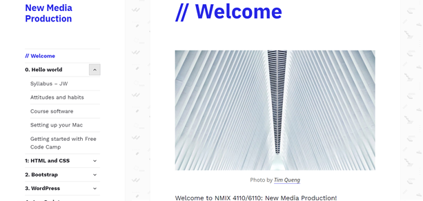
For my final project, I chose to redesign a site that was very familiar to me: the New Media Production Course website. I love the visuals and functionality of the website, however I wanted to put my own twist on it. My main goals for this redesign was to change the visual design and make the website interactive rather than just a site for accessing content.
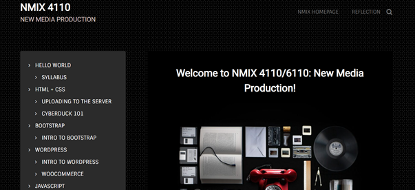
I think the most drastic change when comparing these two websites is the visual element. I really played into the darker, gamer-esque design that makes you feel like a true web developer. When scrolling through the website, it brings you into an environment that makes you feel like a tech wiz, and I had a lot of fun creating the website to make it feel that way.
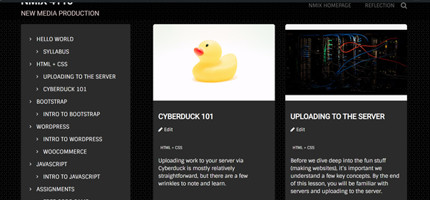
My next step after the visual redesign was finding ways to make the site more user-friendly. Just to clarify, I love the current New Media site (I really do), but I discovered cool aspects that I think make the website more resourceful. For my navigation bar, I categorized all of the posted content, and you are able to click on the categories themselves. They will then display every post in that category with a header image, post title, and a little blurb about what the post is about. This could be very useful if there are a lot of posts, and a user isn’t quite sure what they are looking for.
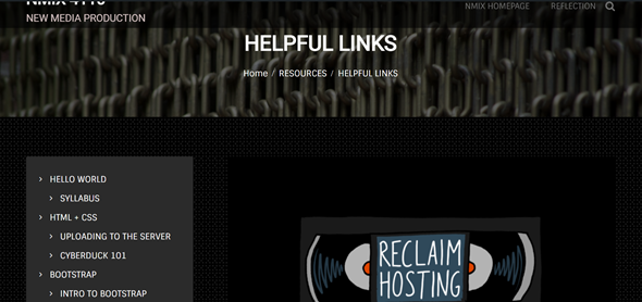
Another feature I wanted to add was a quick and easy place to find helpful or commonly used links. I made sure to add buttons at the footer of the website including all of the New Media Institute’s social medias including Instagram, Facebook, Twitter, and LinkedIn. Also, I created a post called “Helpful Links” that will direct you to websites we have used a lot this semester in one simple click. I included links to Reclaim Hosting, Free Code Camp, Visual Studio Code, Cyberduck, and the New Media Institute website.
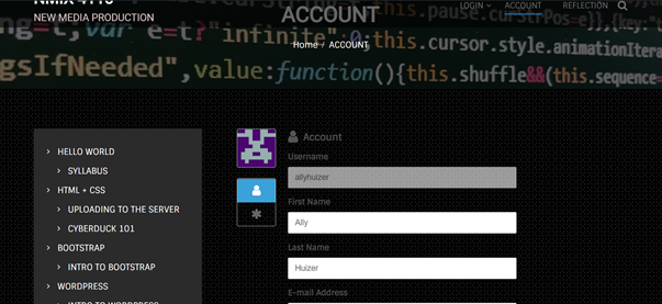
The aspect of the project I am most proud of is making the website interactive. I struggled a lot with how I wanted to do this and what I thought would be most effective on the website. Rather than having to use ELC or Slack, you will be able to find all of those features on this one website. This makes it a lot easier for the professor and students because they will primarily be using this site. With the Ultimate Member plugin, I was able to create a page where students could register an account for the class and login into the course as if it were on ELC. I made it to where all content is restricted unless you login. Now, each user has a profile where they can add their information, change their profile picture, and access course material.
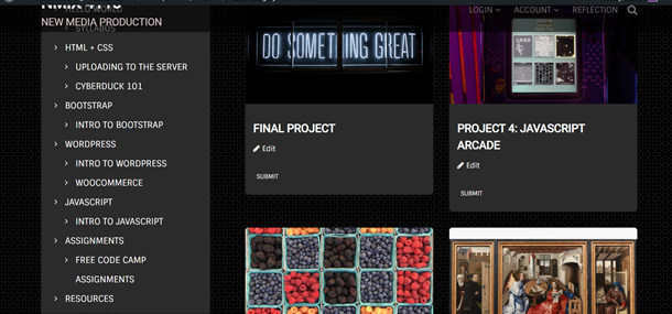
Aside from accessing content, users are able to submit links to the projects they will complete throughout the semester. I installed the WPForms plugin and created a submission form for every project that can be accessed by clicking on “Account” and then “Submit”.
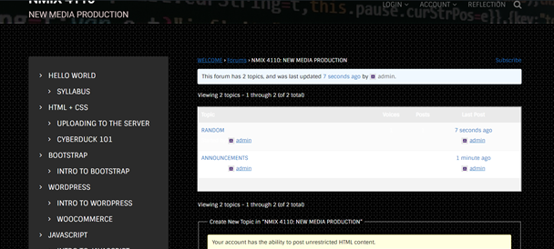
Finally, I wanted to include a discussion section, so students wouldn’t have to use Slack. I installed the bbPress plugin and created a forum for the New Media Production course. I added the topics “Announcements” and “Random” where users would be able to view any announcements from the professor or ask questions about any content they are confused about.
I am most proud of the interactivity of this website because I had no clue what the best plugin would be or how to even do it. After some research and trial and error with different plugins, I was able to figure it out. Throughout the process of creating this site, I learned to take a step back and plan everything out without going in full speed. I had many ideas in my head, but they weren’t fully thought out, and I could have used my time more wisely if I had planned things out beforehand. Another valuable lesson I learned was becoming more aware of user ability. I paid attention to small details of the site to make sure they weren’t confusing or didn’t make sense to the user. I think it is valuable to have this awareness when you are a creator for anything. Overall, this final project pushed me outside of my comfort zone, but I really enjoyed creating it and learned valuable lessons along the way.